Just one more post about last week's workshop. Unlike most of the fiber arts classes I've taken, this one included several accomplished printmakers who'd never worked with fabric or fiber-reactive dyes before. Gerrie and I proved to be resources for those folks, and they in turn gave us a new perspective. I'm generalizing wildly here, but it seems to me that printmaking is about precision; the desired result is a discrete object, the print itself. Art quilters have a different attitude; they'll try anything that might result in an interesting surface. There is such a thing as art cloth, where the finished yardage stands on its own, compositionally. But we don't hesitate to cut into the middle of a fabric we've created to get just the right fragment for a work in progress. Unlike printmaking, painting or weaving, the whole-cloth design often doesn't matter.
I've developed a practice of bringing unsuccessful efforts from previous workshops, or boring fabrics from my stash, to class, just to see whether a new process, an additional layer or two, might redeem them in some way. This piece (below) started life as a portion of a bedsheet. I overdyed it with purple and screen-printed my own made-up mysterious runic symbol all over it. Ho hum. In last week's class I painted a shadow effect around portions of the markings, hoping to get a sense of depth. Mmmm, not so much. I used a dye that someone had labeled "purple," but that turned out to be blood-red. Quite the color combination there:
But as the dye dried, either the soda ash in the dye mixture or some interaction between the red and the earlier turquoise, or the even earlier purple, pushed out a fine white line between colors. The overlaid red on turquoise is kind of interesting, too. Tiny portions of this overall failed effort actually show promise. If and when I use this piece, I'll probably zoom in on those cool little bits and leave the rest of the fabric in tatters:
Another piece started life as solid yellow commercial yardage, which I wrapped and overdyed in an indigo workshop last year. Experimenting with dye painting, I did a few brushstroke squiggles, immediately realized my error, and attempted to wash them out. But because I'd used orange, of which the red component is a notorious dye bully, the squiggles remained. The piece, overall, reminded me of light filtering down through water. So, in last week's workshop, I screened on several fish. I remembered to account for the eyes, but the overall effect was a basic silhouette, too elementary-schoolish (no pun intended). So I stenciled a few markings onto each fish and discharged them with our bleaching agent of choice, thiourea dioxide, a.k.a thiox. As it happens, neither turquoise dye nor indigo bow down to the lightening powers of thiox, so the blue crept right back in when I washed the piece. What to do? Common household bleach to the rescue! It turns out that Soft Scrub (tm) or lotion-style Comet (tm) with bleach does the job. I used the same stuff later to print my leaf stencil (visible on the red and orange fabrics here) onto denim. It worked great, and it's the perfect consistency for screening right out of the bottle.
Shortly after I first started quilting, I acquired somewhere a length of men's shirt-like fabric, light gray with faint stripes and a tiny pink-and-magenta repeated motif. At some point I stamped it randomly with a magenta grid pattern. That did not alter its deeply uninteresting nature; if anything, I'd managed to transform it into something overtly ugly. Last week in class I did a series of swirly monoprints over it, in green, and, on top of that, printed my Japanese maple photo emulsion screen. Close-cropped, it's more interesting, at least, than it used to be. If it doesn't work as whole cloth, I can always cut into it when I need a gray-magenta-green sort of busy intertwined fabric with men's-tie motif markings. You never know.
17 July 2008
Poet F#@kin' Laureate!
This is the best news I've heard in days. I'm so happy for Kay and her spouse Carol. I just hope they don't expect her to write a poem in praise of the current Administration.
16 July 2008
Don't try this at home
One takeaway from the workshop way of life is the realization that there are some techniques and processes you just don't want to pursue on your own. That, in itself, is often worth the price of admission. You get to try something new without investing in equipment and supplies that you'll probably never use again. Last week's screen printing workshop produced two such "never again" conclusions.
One was devoré, the process that produces those beautiful cut-velvet scarves and other garments you see in stores. It involves applying a pattern using a toxic chemical solution that eats away the cellulose fiber (rayon or cotton, for instance) in your fabric, leaving the sheer silk backing. After the solution dries, you iron the treated portions til they turn the color of café-au-lait. At that point the nap starts falling off in those areas; rubbing gently usually gets rid of the rest of it.
All this time you're wearing a fume respirator -- not just one of those puny dust masks -- and rubber gloves. One runs the risk of starting with a too-hot iron and, peut-être, scorching portions of the backing fabric all the way to espresso. When rubbing off the nap, one might rub a hole in the delicate, now-compromised, silk. Ask me how I know this. Between the ambient toxicity and the fiddliness of the process, I strongly suspect that this might have been my sole attempt in life at doing devoré. Still, I'll mend the holes with silk thread and dye the piece, and perhaps produce a scarf that comes with modest bragging rights.
I hesitate to dismiss photo emulsion as cavalierly as I have devoré. It's an interesting process and fabulously versatile, but it requires a darkroom, a light box, and considerable deftness in applying the emulsion to the screen. You start by preparing a black line image -- an ink drawing, a stencil pattern, a photograph that you've tweaked in Photoshop to get rid of the gray scale values -- and copy it onto transparent acetate. In the darkroom, you coat a screen with a liquid light-sensitive photo emulsion and let it dry. Then you lay the acetate on a light table, position the treated screen on top of it, and expose the image for four or five minutes. Finally, you wash the screen quickly, under a strong spray of water, while the image gradually emerges on the emulsion. On the unexposed portions -- the parts that were black on your original image and on the acetate copy -- the emulsion washes away, leaving clear areas on the screen. From that point on, you work with it as with any other stencil; the clear portions allow the dye through, the coated portions block it. You can burn more than one image on a large screen and, when you print, mask off the ones you're not using. I used a public domain Japanese stencil design (thank you, Dover Books), and one of my own photos of a Japanese maple. Here's my first screen in its virgin condition:
And here are a couple of the prints I made with them. I'm pleased with the crispness of the black stencil on denim, and with the multicolor tree on a hand-dyed orange-y cotton:
Later I burned another stencil, a delicate bamboo pattern, on a smaller screen. It gave me eight or ten nice prints, and then started producing big blobs along one edge. I realized to my horror that the emulsion was peeling off. Apparently these things happen. It was nice while it lasted. I'll just think of it as a limited edition print run:
15 July 2008
Stella Luna visualizes a late-night snack
I have a couple more posts about last week's screen printing workshop lined up and almost ready to go. In the meantime, here's a lucky catch. You might call it a reflection from the door glass superimposed on the critter outside, but I call it a rare and mystical glimpse into one cat's consciousness.
Five Days a Week
Last week I remembered what it felt like to commute to work. Gerrie and I took turns driving out to OCAC, four days in a row, for yet another art workshop. We left home at 8:30 and got home between 4:30 and 5:00. On day five we had to drive separately, but the routine was the same. Everything else in our lives -- cooking, email, catching up with family -- had to be accomplished between our arrival back home and bedtime. How do working people manage? For me the pressure was greater than it would otherwise have been, because Jer was in New Hampshire for his high school reunion. I even had to prepare meals for myself; the horror.
The bright side is that the hours between 9 and 4 felt more like play than work. For five days we explored screen printing -- apparently the preferred term now, since silkscreens are no longer made out of silk -- from simple stencils made from freezer paper or masking tape to tricky photo emulsions. Here's my wall o' stuff -- some of the better stuff, at least -- at the end of the workshop:
When you're immersed in art, you see everything through art goggles. Both this bubble pattern in a soaking bucket and the remains of my midmorning snack struck me as potential silkscreen designs:
Got dye? The studio refrigerator (below) is full of dye solution, print paste and assorted other chemicals. No food allowed, needless to say. The retro aqua interior adds to the skeery effect, casting a sickly aura on its contents:
I love the point in a dye workshop when your fabrics come out of the washer, colors fixed, and you hang them on a clothesline in the full light of day. It's sort of like a gallery show. Here's some finished work -- mine and others -- drying on the line:
06 July 2008
Surface Design
My dear friend Mona gave me the t-shirt, so I had to join the Surface Design Association to make an honest woman of myself. Do you like what I've done with the cat hair? It's part of an ongoing mixed-media series, and perhaps my signature motif.
Speaking of surface design, here's the organza piece I re-dyed in last week's workshop, folded over a couple of times, which quadruples its intensity. The more I look, the more I see in it. Trippy, man:
I couldn't help but notice a similar lattice motif echoed in Jerry's latest artwork:
Speaking of surface design, here's the organza piece I re-dyed in last week's workshop, folded over a couple of times, which quadruples its intensity. The more I look, the more I see in it. Trippy, man:
I couldn't help but notice a similar lattice motif echoed in Jerry's latest artwork:
05 July 2008
Taking the Fourth
It was a quiet 4th of July in our little corner of Portland. Jer and I strolled down to the neighborhood parade, a four-block round-trip spectacle consisting of decorated kids, dogs, bikes and parents.
Afterwards, Otto's, a Woodstock Blvd temple of cured meats, gives out free hot dogs. The line appeared ridiculously long, but moved quickly. Two 4ths ago, I decided to have my first hot dog in decades and got hives all over my body. I considered that a message from the universe, and have passed on the 'dogs since then. Jer pronounced his "routine," but isn't "routine" what celebrations like this are all about?
Despite its intimate size, our parade rated a real fire engine and significant police escort. This must be the easiest duty these guys could possibly pull.
On our way home, we encountered this charming bit of home-grown neighborhood boosterism. The sign was posted by Maddie and Sarah, and it reads: "For people that are moving or visiting there is a flower garden here in Portland either <- that way or this way -> . So look both ways. Go one way and then the other and I bet you'll see it. Thank you."
Later on, we donned what we've come to call our Fireworks Shirts, the loudest tie-dye on the planet, and walked up to Oaks Bottom Pub for a late dinner. We were greeted with indulgent smiles and peace signs along the way. Twice, we were asked whether we'd gotten the shirts at Woodstock. Yes, we are old hippies. And your point is...?
Our fireworks game plan was to continue down 13th to Sellwood Blvd and watch the Oaks Park display from somewhere along the bluff. Perhaps we could catch a glimpse of the downtown show as well. But we turned a block early and ended up at the end of a cul-de-sac, possibly in someone's side yard and conceivably in the midst of a private party. By then it was dark, but the crowd was friendly and we hunkered down for the show. I'm pleased with how well my camera handled the low-light conditions. Apparently it has fireworks recognition built in.
Chef Jerub topped off the holiday weekend by making a perfect lattice-crust peach and berry pie. This is very similar to the one with which he won my heart almost 28 years ago.
02 July 2008
Disneywoods and fabric remnants
My gift certificate was burning a hole in my pocket, so Monday morning Jer and I headed out to the Audubon Center on NW Cornell Road. We timed it so we could do our daily walk in the network of trails behind the sanctuary and then have lunch at the Skyline Restaurant, just a couple of miles down the road. Look at that man balancing a huge tree trunk on his head:
We walked the Jay Trail, a .9 mile sort-of-loop, and were amused and amazed by the bizarre tree specimens we encountered along the way. It was as if some Eftian theme park crew had installed weirdly shaped formations for our entertainment pleasure. I've posted a few examples on Flickr; they're at the top of my Photostream as of today, but they're all searchable via "Jay Trail" or "Forest Park" or "Audubon Center," in case you're reading this in, y'know, posterity or something.
Here's a merely arty shot. I've entitled it Lichen It a Lot:
The Jay Trail itself is beautiful, and connects with the Wildwood Trail, which leads deeper into Forest Park. Another whole region to explore someday.
We ended our walk at the Audubon store, where I redeemed my gift certificate on one of those freestanding metal posts with a graceful curve and a hook at the top, designed to hold a bird feeder. When we got home we found a place for it in the back yard. I'd been thinking about getting one for a while, so: perfect.
I was conflicted that morning about going on an expedition; I had so much fabric from the workshop to steam, wash, iron and photograph. But I got to all that later in the day. Here are a few (last, I promise) details that I thought were particularly cool. Can I start calling it "art cloth" yet?
This mysterioso red and black fabric turned out to be a lot more interesting than I thought at first. It has very deep, almost photographic, shading and a lot of subtle movement when you look at it closely. This represents just a few square inches of a much larger piece:
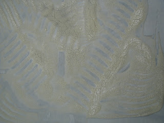
The organza scarf to which I'd applied potato dextrin, then brushed with green Procion dye, is subtle, as pictured below. But as I was folding it to put away, I noticed that the combination of crackles and underlying indigo, when layered, was spectacular in spots. So this is just a placeholder to remind me to try to capture an image or two of the piece, folded over once or twice:
Years ago, in my old guild in California, I took a workshop with Velda Newman. She does some beautiful work, but it was one of those experiences from which you emerge thinking "Well, now I know I don't want to do that again," thus justifying the price of admission. We made giant fruit and vegetables out of quilters' cotton, which we painted and shaded realistically. The canteloupe with cheesecloth overlay, simulating the netting on the surface of the melon, still resides in my UnFinished Objects bin. My takeaway from that workshop, though, was permission to paint fabric with acrylics, or anything else for that matter. Here's a small wipecloth, about eight inches square, that I did toward the end of that class, just vertical brushstrokes in leftover colors. It was insipid, but I kept it because I keep everything. It's been in my stash for almost four years. Last week I did the potato dextrin resist number on it, then overdyed it with a dark olive-y green. My husband thinks it's a finished piece in itself, which is one reason why I love him:
Finally, here's the piece de resistance of serendipity. This is a detail of a rectangular piece about 15 x 18" that I first tried brush painting, in orange. My attempt to channel my inner Japanese calligrapher proved unsuccessful, so I did a Jackson Pollock number all over it in black. (The whole cloth is here, top center.) But when I applied that first downward brushstroke on the right, the folds of the dropcloth underneath produced these perfect bamboo-like markings. Spooky, huh?
01 July 2008
There will be dye
Above is my OCAC work table at the end of a productive dyeing day. Below, another shot of my area on Sunday afternoon, as the workshop was winding down.
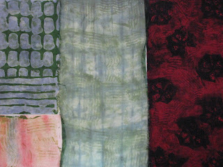
Below are a few more examples of the liquid resist work I did there. The small pinky square in the lower right was a nondescript scrap I'd painted at some point with acrylics. Daubed with potato dextrin and brushed with green dye, it's marginally more interesting. The middle piece is organza that I'd indigo shibori-ed in a previous workshop, now given the potato dextrin treatment and a coat of the same green dye. You can see a lot more detail, of course, if you click to enlarge the photos.
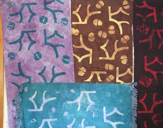
Despite my infatuation with potato dextrin, I was pleased with some of my results using other techniques. For instance, I marked several pieces of cloth with this silkscreen design (below), plus some random stamping here and there. First I re-cut the stencil I'd used in a previous workshop with Jeannette; this time, instead of putting thickened bleach through the screen to remove color, I used thickened dye -- putting color on, instead of taking it out. I also used the same stencil with a corn dextrin resist, rolling thickened dye over it later. When I washed out the resist, the stenciled form appeared in the color of the original fabric.
The horizontal blue piece at the bottom is an antique dresser scarf that was originally white. I dyed it in the same indigo workshop as the organza up above, with similarly blah (a.k.a. "very subtle") results. It was buried under books on Jerry's bedside table until last week, when I reappropriated it for my workshop stash.
It was big fun playing with the various silkscreening permutations. In the process, I also created some lovely patterns on the dropcloth:
Painting with dyes, especially on damp fabric, is a much freer and more improvisational process. Applying the dye with a syringe instead of a brush turned it into a Jackson Pollock-y process: keep moving, don't hesitate or ponder; work fast but gracefully. You can pause between colors to decide if it needs more. Now I know how those expensive "designer" sweatshirts I used to covet at Noma in Gualala are done.
The grid pattern on the lower left was done by laying a piece of patterned plastic under the fabric, then rolling over it with a dye-laden (but not too laden, I eventually came to realize) foam roller.
Yes, those are cut-up jeans at the top left. I didn't buy an inch of new fabric for this workshop. Everything is either overdyed commercial fabric or yardage I'd previously dyed myself. The dark-red material appearing here and there used to be the lining for the striped velour drapes that Jerry sewed (!) for the bedroom and living room of the first house we bought in the Bay Area. We still have a pair in our bedroom here.
The Potato Dextrin Process, by Robert Ludlum
Okay, I'm kidding about the Robert Ludlum part. It just sounds like something he'd write. I know you were breathlessly waiting for a download from the art workshop I did last week, Working with Liquid Resists and Thickened Dyes.
First, the word "resist," used as a noun, means a substance or object selectively placed on portions of the fabric you're working with to protect it from the dye or bleach or other transformative medium you plan to apply next. The "resisted" (transitive verb; interesting...) areas will be unaffected by whatever happens to the rest of the fabric.
A resist can be as simple as a wood or plastic block, strips of masking tape, or string. Many forms of Japanese shibori use the fabric itself as a resist, folded, stitched or scrunched so that the indigo dye penetrates unevenly. Remember tie-dye? When you wrapped those t-shirts in rubber bands or lengths of string, you were preparing fabric for resist dyeing. Who knew? We thought "resist" had only one meaning back in the '60s.
In this workshop, we played with two types of resist new to me: corn dextrin and potato dextrin. Both are powdered starches that mix with water to form a gloppy paste. You can brush or silk-screen them onto fabric, or stencil or stamp or rub them on. All kinds of found and repurposed materials come into play -- construction fencing, computer parts, plastic mesh produce baskets, ravioli presses, potato mashers. Believe me, when you get into this stuff, you'll never look at a hardware store, or your own kitchen, in quite the same way.
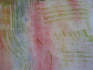
Potato dextrin is particularly cool to work with because, as it dries, it cracks in very interesting ways, as shown in the following photo. You can just spread it around on your fabric in a random manner, and then comb it around a bit. It's very much like finger-painting.
When the dextrin is dry, you apply dye all over, in a color or colors of your choice. You can use a roller with corn dextrin, since it dries smoothly. With potato dextrin, you have to dab the dye with a brush, as shown below, to make sure it penetrates through all the cracks and onto the fabric. Potato dextrin is all about the cracking.
Below are four of my pieces, all glopped up with dye and ready to sit overnight. You can always tell my work area by the ubiquitous Nalgene water bottle.
You let the dye dry and cure, and then wash off the resist to reveal your pattern. The photo at the top of this post shows the same four pieces, all washed and dried. Here's a closeup of one of them showing the wonderful crackly texture.
Subscribe to:
Posts (Atom)